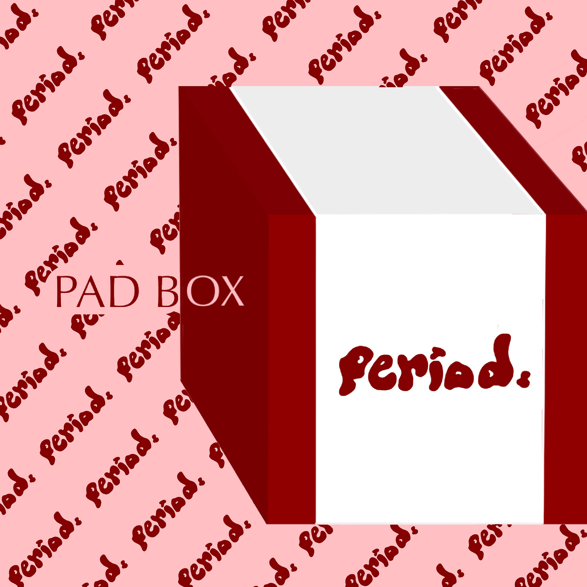
This is a self-project I took on while trying to expand my bandwidth in different types of products for different media. With menstrual cycles being conventionally pushed under carpets and seen as taboo, I wanted to create packaging for a mock-brand who sells female sanitary products boldly. Clad in a royal, bright red outer-box, the packaging makes a loud statement. The brand's attitude is underscored by the both free-flowing and simple logo, "Period.," which stands out against a plain white strip, simulating a pad or similarly-purposed cotton material.