
Talk To Me In Korean, or TTMIK for short, is a learning resource loved and used my millions of users across the world. Being one of my favorite companies as well as one I have gained so much help and knowledge from, thought it would be fun to redesign their logo, as their initial logo doesn't seem very unique or characteristic. My goal with my redesign was to make it more condensed and refined, incorporate references to the Korean culture, and portray TTMIK an approachable but trustworthy learning source.


ORIGINAL LOGO

NEW LOGO SKETCHES

TWO REMAKE DRAFTS

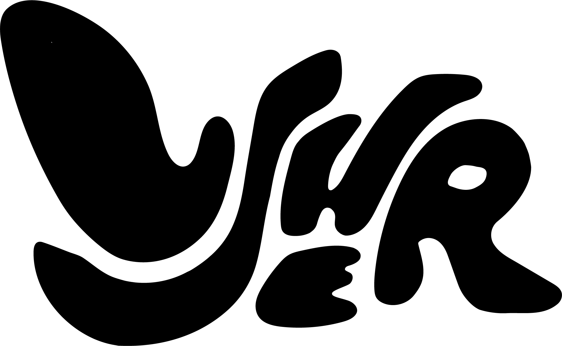
FINALIZED LOGO REMAKE
This refined logo incorporates the Korean character system, hangul. Specifically, the "yu" vowel, 유, which can playfully refer to the learner as if to say "you talk to me in Korean." The character in this logo also resembles a bridge with a train whipping past, symbolizing a "bridge" to learning. I used the colors red and blue to mimic the Korean flag.


